

Jobs Numbers Don’t Lie (Until They’re Revised)
What the September Payroll ‘Shocker’ Really Means

Rebel Capitalist AI | Supervision and Topic Selection by George Gammon | November 22, 2025

We finally got the September jobs report, and Wall Street can’t decide whether to throw a party or panic. The headline payroll number blew past all forecasts...120k new jobs versus an expected 105k. But the unemployment rate rose to a four-year high.
How does that even make sense?
Welcome to the post-2020 labor market: a data minefield where headline beats hide deeper weaknesses.
In today’s post, we’ll look at:
Why the jobs data might be a mirage.
How the labor force is quietly shifting.
What the Fed might do next.
And why Walmart’s earnings say more about the real economy than any BLS report
And as you’ll see in a moment, once the shine wears off that top-line number, everything underneath starts to look a lot less like strength...and a lot more like a warning.
The Payroll Headfake
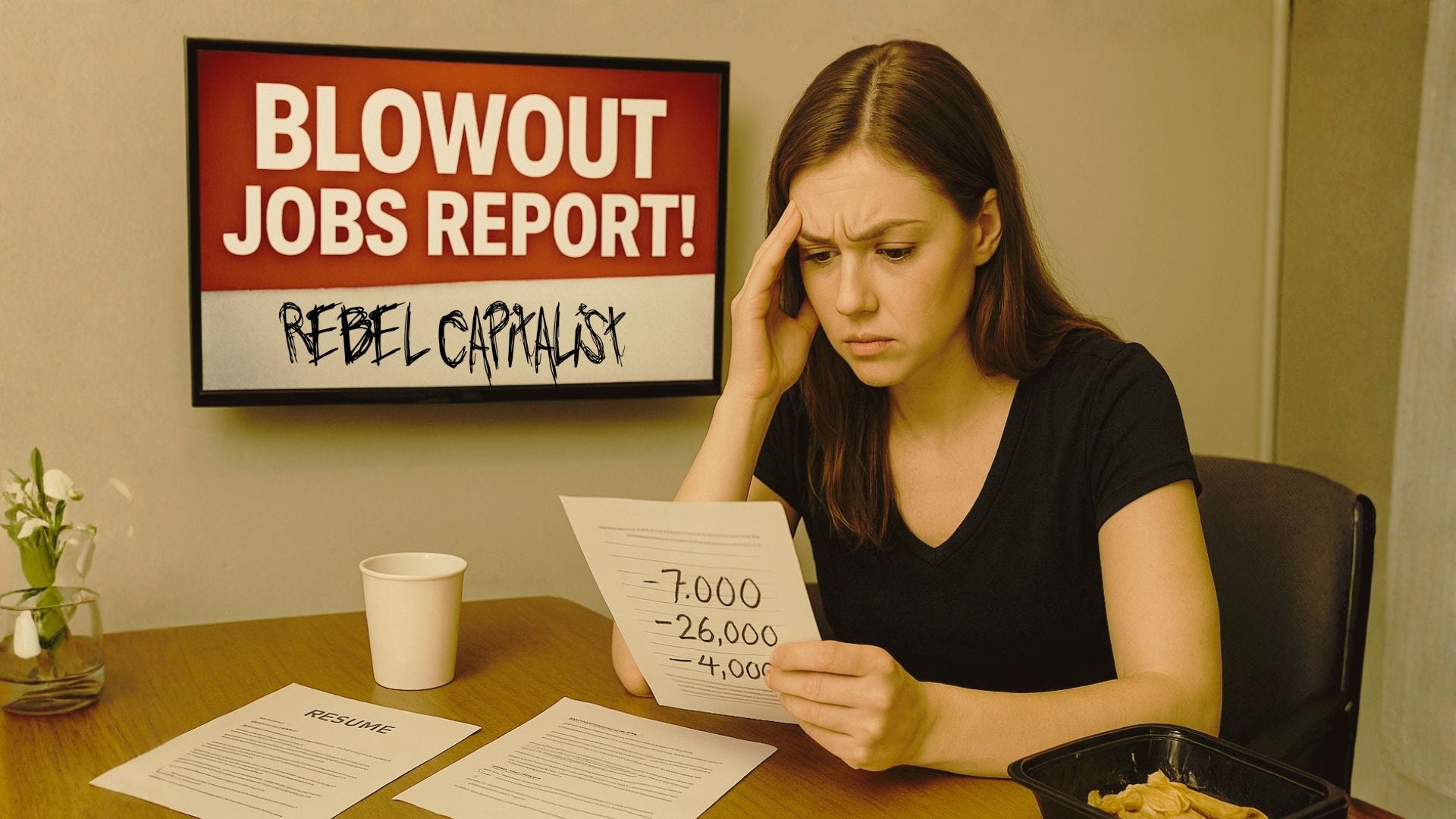
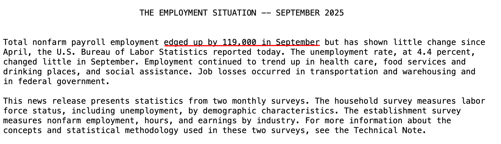
At first glance, the September payroll report looked strong: 119,000 jobs added, handily beating the most optimistic Wall Street forecasts. But that headline number has a sketchy track record...as George pointed out, we’ve seen this movie before.
The revisions to prior months were ugly:
July revised down by 7,000.
August slashed by 26,000.
And the real shocker: August’s jobs number revised from +22,000 to −4,000.
That’s not a typo. It went negative.
If this trend holds, today’s blowout 119k number could easily get revised down by tens of thousands...or worse.
It’s become the “boy who cried wolf” scenario: every month, we get an upbeat headline, only to be undercut by a brutal revision weeks later.
So what is the market seeing? Not the top line. It’s the pattern.
And if the pattern is deteriorating this fast, the next logical question is: what’s happening beneath the surface that the headline payroll number can’t hide?
Labor Force Participation: The Real Story
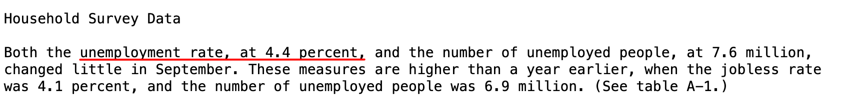
The unemployment rate rose to 4.4%, the highest in four years. But it didn’t rise because people lost jobs. It rose because labor force participation increased.
Translation? People are going back to work not because they want to, but because they have to.
Whether it’s retirees returning due to inflation, or households losing pandemic-era stimulus buffers, the American worker is being pulled back into the game...not out of optimism, but out of necessity.
George framed it this way: imagine someone who retired early thanks to a booming stock portfolio and stimulus windfall. That same person now faces skyrocketing living costs and no safety net. So they re-enter the job market.
Multiply that story across millions of households, and you get rising labor force participation...and higher unemployment.
But if the labor force is rising out of desperation rather than opportunity, it raises an even more uncomfortable question: what does that mean for the quality of the jobs being created?
Full-Time Up, Part-Time Down: A Strange Divergence
Another curveball: full-time employment rose, but part-time jobs fell off a cliff. According to the data:
+673,000 full-time jobs
−573,000 part-time jobs
This isn’t typical. Usually, part-time employment surges in weak economies as businesses cut hours and workers pick up side gigs.
The opposite is happening now, possibly signaling a shift back to more stable work arrangements...or a quirk in the seasonal adjustment process.
Either way, it muddies the waters.
And when the data gets this noisy, investors start asking the only question that matters: which signal is the “tell,” and which one is the head fake?
The Market Doesn’t Buy It
So how did the bond market react to this “blowout” jobs report? Rates fell.
That’s right: despite the upside surprise in payrolls, yields on the 2-year Treasury dropped by 2–3 basis points.
Meanwhile, the probability of a rate cut at the December FOMC meeting jumped from 30% to nearly 40%, according to CME FedWatch.
In other words, the market sees through the illusion.
Between rising unemployment, weak wage growth, and consistently downward revisions, this economy doesn’t look healthy. It looks tired.
And if the bond market is already leaning toward cuts, the natural next step is to examine the sectors that usually flash red before the Fed does.
Manufacturing Is Flatlining
Manufacturing jobs have now fallen for six straight months. That’s a flashing red warning sign for the real economy. If we’re really bringing manufacturing back to the U.S. through tariffs and reshoring, why aren’t the numbers showing it?
Because certainty matters more than slogans. Businesses won’t invest in new factories when they don’t know what next year’s tariff rate will be...5%, 25%, or 50%. The rules keep changing, and investors hate uncertainty.
And when manufacturing stalls, the ripple effects tend to show up somewhere very specific...consumer behavior. Which brings us to Walmart.
Walmart: The Real Canary in the Coal Mine
While BLS data gets revised and debated, Walmart is delivering real-time insights.
The retail giant beat earnings expectations and even raised its guidance. Sounds bullish, right?
Not so fast.
Walmart’s growth is being driven by wealthier shoppers. More high-income Americans are now shopping at Walmart to cut costs. That’s not a good economic sign. It’s a signal that price sensitivity is rising even at the top of the income ladder.
This is what a downshift in living standards looks like. When middle- and upper-income households start trading down, you’re not in a “soft landing.” You’re in the early stages of something much worse.
And if the consumer is already strained, just wait until you see what’s happening to wages...the fuel that keeps the whole machine running.
Earnings Growth Is Slowing
On top of everything else, wage growth is stagnating. That’s another blow to the idea that the consumer will “save the day.” Without strong earnings, consumption falters.
And consumption is still 70% of U.S. GDP.
And once consumption slows, the Fed steps in. But as George pointed out, their playbook is predictable to the point of parody.
The Fed Playbook: Cut, Pause, Cut Again
George wrapped up his analysis by looking at past Fed cycles. The pattern is clear:
Fed raises rates until something breaks.
Fed pauses, then cuts by 1–2%.
Market thinks it’s over.
Economy deteriorates further.
Fed cuts even more.
We’ve seen this in 2001, 2008, and 2020. There’s no reason to think 2025 will be any different. If anything, the downward revisions and labor market churn suggest we’re closer to Step 4 than Step 1.
George’s takeaway? He’s adding to his long position in the 2-year Treasury. The market is pricing in cuts. The data supports it. And historically, the Fed overshoots in both directions.
And if history is any guide, the real shock won’t be the first cut...it’ll be the second and third. That’s when the cracks turn into fractures.
Don’t Trust the Headline
September’s payrolls might look good on the surface. But scratch that surface, and you see:
Rising unemployment.
Labor force stress.
Weak wage growth.
Declining part-time jobs.
Fading manufacturing.
And consumers trading down.
The economy isn’t crashing...yet. But it’s fraying. And if the Fed doesn’t see it soon, the next move won’t be a soft landing. It’ll be a hard truth.
And the people who navigate that truth the best will be the ones who stop trusting headlines...and start studying what the data is really saying.
If You Want the Truth Before the Revisions Hit…
If you’re reading Rebel Capitalist News Desk, it’s because you don’t trust the mainstream narrative...and you shouldn’t. By the time CNBC starts asking the right questions, the market has already moved.
Premium subscribers get:
Real-time breakdowns of macro data BEFORE it gets revised.
George Gammon’s private research notes and market positioning.
Deep-dive reports you won’t see on YouTube.
Play-by-play macro coverage when volatility spikes.
And the unfiltered, contrarian analysis investors actually need to survive this cycle.
If you want to stay ahead of the lies, the spin, and the revisions, now is the time to upgrade.
Become a premium member today:
Because in this economy, the cost of being wrong is far higher than the cost of staying informed.