
There is a number in last week’s jobs report that should have been the headline. It was not the 57,000. It was not the unemployment rate. It was sitting two tables down in the same government release, and it said that half a million fewer Americans were working in June than in May. Half a million, in one month. And the story you were handed was that unemployment went down.
So take the attention off the Middle East, where it has understandably been parked for three or four months, and put it back where it belongs. Back on the labor market. Because everything comes back to how many Americans are actually working.
![[Section Divider Image]](https://substackcdn.com/image/fetch/$s_!j1vp!,f_auto,q_auto:good,fl_progressive:steep/https%3A%2F%2Fsubstack-post-media.s3.amazonaws.com%2Fpublic%2Fimages%2F531ea433-fa2c-4989-ab8b-c8ae264dd986_1320x50.webp "[Section Divider Image]")
The June jobs report: a stuck-in-the-mud number, then something worse
Start with the warm-up act. On Wednesday, ADP reported private employers added 98,000 jobs in June, against a consensus of 110,000. Not a catastrophe, but in an economy of 340 million-plus people, it is the sound of an engine that will not quite turn over.
Then Thursday. The Bureau of Labor Statistics put out the June employment situation and the headline establishment number came in at 57,000 jobs against a Wall Street consensus of 115,000. Roughly half. And to make sure nobody mistook it for a blip, the BLS revised April down 31,000 and May down 43,000, a combined 74,000 jobs reported to exist a month ago that quietly did not.
Here is the part that reads like a magic trick. With a jobs number that soft, the unemployment rate did not hold at 4.3%. It fell to 4.2%.
How do you print a bad jobs number and get a better-looking rate in the same breath? The rate did not improve. The denominator shrank. Labor force participation dropped three tenths of a point to 61.5%, the lowest since March 2021. People did not find jobs. They stopped being counted. To be counted as unemployed you have to have actively looked for work in roughly the last four weeks, so millions can want a job and not find one, and as long as they have stopped hunting, the headline rate looks better, not worse. The number can improve for the worst possible reason.
The number nobody front-paged
Now flip to the household survey, the one the BLS actually uses to calculate that tidy 4.2%. From May to June, the number of employed people in it fell by 507,000, and the civilian labor force contracted by 720,000. Read those against the headline. The establishment survey says the economy added 57,000 jobs. The household survey says half a million people stopped working and nearly three-quarters of a million left the labor force. Same press release. One got wall-to-wall coverage. The other got silence.
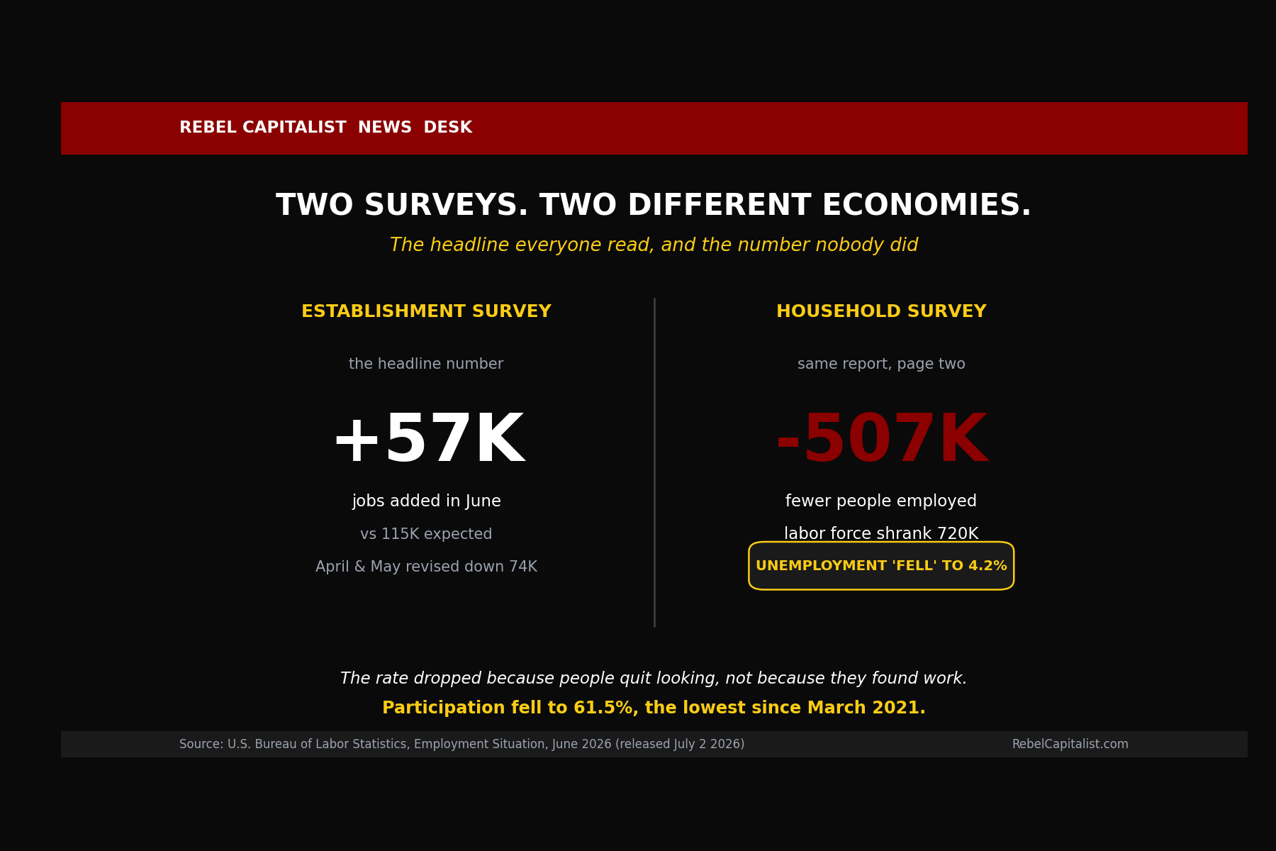
...already well below expectations of 115,000. But a second, less-publicized measure showed 507,000 fewer people were actually employed that month. The unemployment rate fell to 4.2% not because more people found work, but because 720,000 people stopped looking for jobs entirely. When people stop looking, they are no longer counted as unemployed...making the job market look better than it really is.
And look at what led the June losses: leisure and hospitality, down 61,000. That sector has been one of the main engines of job growth for two years, and it just swung to an outright decline. Leisure and hospitality is discretionary spending, the thing a family cuts first when money gets tight. When hiring there goes negative while the savings rate is getting hollowed out, that is disposable income telling you something.
From above 4% to 1.2%, and it does not even include this yet
Here is where the labor data stops being a standalone story. The Atlanta Fed’s GDPNow tracker for the second quarter estimated growth above 4% in mid-May. Real GDP, annualized. Sunshine and birdsong. Then it walked off a ledge. By June 25 it was down to 2.5%. By July 1 it printed 1.2%.
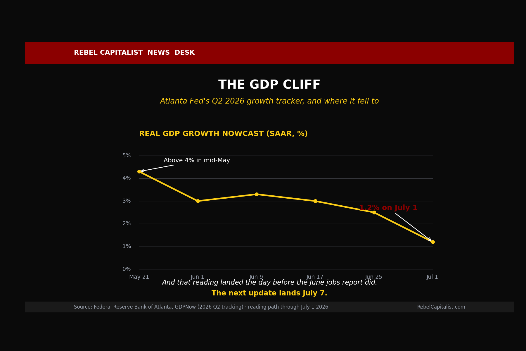
And here is the detail that should make you sit up. That 1.2% is dated July 1. The jobs report landed July 2. The worst labor print in months is not even baked in yet, and the next update lands July 7. When a model has already fallen from above 4% to barely over 1% before the bad data, you cannot sweep the direction of travel under the rug.
Why does the labor market drag the whole thing down? Follow the money. Fewer people working means less income and softer aggregate demand, which the model reads directly. But the second channel may matter more. Every paycheck flowing into a 401(k) is an automatic, price-insensitive buy order for the S&P 500. It does not ask whether stocks are cheap. It just buys. That passive bid props up asset prices, and propped-up asset prices prop up the economy, largely through AI capital spending. Fewer workers means a thinner bid under the index and less appetite from the mega-spenders to keep the buildout going. Pull one paycheck out and you are pulling a thread that runs straight into the largest single source of growth in the economy.
The stool nobody wants to look under
That AI buildout is the leg of the stool worth examining, because the way it is funded has quietly changed. When this started, the hyperscalers paid for data centers out of positive free cash flow. Not anymore. In early June, Alphabet, one of the great cash cows of the modern era, priced an equity capital raise of $84.75 billion to fund AI infrastructure. Google. Selling stock. A company that had not meaningfully issued equity in two decades, going to market for the largest equity raise in corporate history because the cash it throws off is no longer enough to feed the machine, and that on top of tens of billions in fresh debt over the prior year. When the profitable players are selling equity and debt to keep capex running, you have left the “funded by free cash flow” phase for the “funded by capital markets” phase. And capital markets stay open right up until they slam shut.
Which brings us to last week’s other tell. Blackstone’s data-center arm, QTS, walked away from its portion of what would have been the largest data-center campus in the world, a 2,100-acre project in Virginia. Be fair to the facts: the proximate cause was legal. Zoning approvals were thrown out on a public-notice technicality, a development partner had already exited, and QTS was left holding the full utility-upgrade bill alone. But a private-equity giant deciding the crown-jewel fight is not worth it, right as the profitable tech names start selling stock to fund their own buildouts, is at least worth a raised eyebrow.
Put it all together and none of it, alone, is a crash. Together it has a name.
Below the paywall we lay out the seven textbook signatures of a late-stage credit cycle and check every one against the tape right now, we explain why “no Great Financial Crisis” does not mean the cycle is dead and why the dot-com bust proves it, we tie the private-credit deterioration back into the labor and AI-capex threads, and we get to the part everyone actually wants, the one actionable trade this setup points toward and the single instrument that has historically paid when this stage gives way to the next. Join us beyond the paywall, if you haven’t done so already for this weeks Weekly Wrap-Up.