



![[Section Divider Image]](https://substackcdn.com/image/fetch/$s_!HzYQ!,f_auto,q_auto:good,fl_progressive:steep/https%3A%2F%2Fsubstack-post-media.s3.amazonaws.com%2Fpublic%2Fimages%2F7bd1f83d-4be8-4a47-9e85-cf12af41310a_1320x50.webp "[Section Divider Image]")
The S&P 500 closed Friday at 7,757.64, a record. It got there on the back of a jobs report that showed the American economy shed 23,000 payroll jobs in July.
Read that again, because the sequence matters. The economy lost jobs. The index printed an all-time high. Best week since April.
There is a version of this story where those two facts are in tension, and every headline you saw over the weekend told it that way. Bad news is good news, rate cuts are coming, buy. That version has one problem, which is that the futures market is not pricing a cut at all. It is pricing something close to even odds on a hike.
So what exactly did the market like about a negative payroll print?
Monday and Tuesday: the numbers that got no coverage
The week did not start on Friday. It started on Monday, with two prints that nobody put on a chyron.
Construction spending for June came in at negative 0.1 percent against a median forecast of positive 0.3. Factory orders for June, out Tuesday, printed negative 0.3 percent against a forecast of positive 0.3. Job openings landed at 7.4 million, exactly in line, down from 7.5 million the month before.

There is a ritual that follows misses like these. Within about four hours, someone explains that construction spending was soft because of a specific line item, or weather, or a base effect, and the number gets filed under “noise.” Fine. But if the explanation is that obvious after the fact, why was it not in the forecast before the fact? A median forecast is not a guess pulled out of the air. It is the collective output of economists at Dow Jones Newswires and the Wall Street Journal who are paid to know about the line item, the weather, and the base effect. When the entire profession misses by 0.4 percentage points on a series it models every month, the interesting question is not what the excuse is. It is why the model needed one.
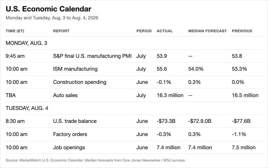
To be fair, and this matters, the same two days carried real strength. ISM manufacturing printed 55.6 against a 54.0 forecast, up from 53.3. That is not a soft number. That is expansion accelerating. Anyone building a bear case has to carry that on the books, not leave it off.
Wednesday: 44,000
Then ADP.
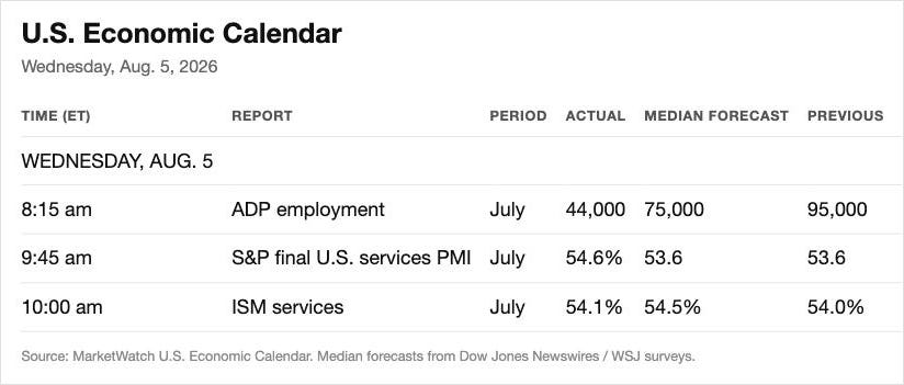
Private payrolls grew by 44,000 in July. The forecast was 75,000. The prior month was 95,000. So the number came in 41 percent below consensus and less than half the previous print, and the previous print was already the weakest in six months.
ISM services, same day, missed at 54.1 against 54.5. Still expansionary. Still a miss.
Thursday: the one number that argues the other way
Here is where the honest version of this gets uncomfortable, and it is worth sitting in the discomfort rather than skipping past it.
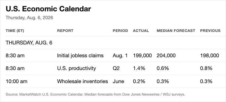
Initial jobless claims for the week ending August 1 came in at 199,000, better than the 204,000 forecast. The four-week moving average sits at 198,750. Two weeks earlier, for the week ending July 18, the advance figure printed 187,000, which is the lowest weekly reading since September 1969. Americans were still watching Apollo footage the last time this few people filed for unemployment insurance.
Continuing claims are not screaming either. 1,801,000 for the week ending July 25, against 1,963,000 a year ago. That is lower, not higher. Anyone telling you continuing claims are at a multi-year high is not reading the series.
Challenger’s July layoff count backs it up: 33,429 announced job cuts, the lowest monthly total in two years, down 27 percent from June and 46 percent from a year ago.
And Q2 productivity came in at 1.4 percent against a 0.6 percent forecast. Productivity growth is genuinely good news. It is the only free lunch in macro.
So the bear case has to answer this: if the labor market is deteriorating, why is nobody getting fired?
The answer is that initial claims measure exactly one thing. They measure the rate at which employed people are pushed out the door. They say nothing whatsoever about whether there is a door open on the other side. Firing is at a 57-year low. Hiring is what stopped. Those are two different faucets, and only one of them shows up in the weekly claims number.
That is also why claims are still the right timing tool despite all of that. In every genuine contraction on record, claims eventually spike. They have to, because at some point the frozen hiring turns into active firing. Which means the useful discipline is not to wait for claims to confirm the story, but to know in advance what confirmation looks like. Not 220,000. Not 250,000. Something north of 300,000 and heading toward 350,000 on the four-week average. Until then, claims are a fact that argues against the bear case, and pretending otherwise is how you end up with a thesis that cannot be falsified.
Friday: minus 23,000
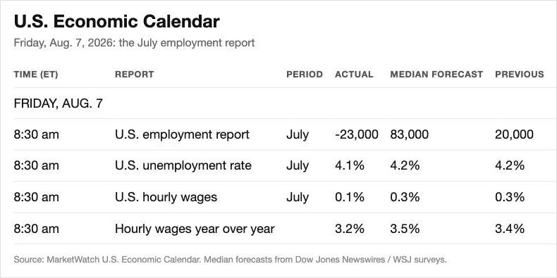
The July employment report landed at negative 23,000 against a consensus of positive 83,000. A 106,000 swing.

Then the revisions, which are where the actual story lives. May was cut from 129,000 down to 63,000. June was cut from 57,000 down to 20,000. Combined, the prior two months lost 103,000 jobs that had already been reported, celebrated, and priced.
Average hourly earnings rose two cents to $37.62, up 3.2 percent year over year against a 3.5 percent forecast and a 3.4 percent prior. Wage growth decelerating.
And the unemployment rate went down, to 4.1 percent from 4.2.
The mechanics nobody walks through
The falling unemployment rate is doing enormous narrative work right now, and it deserves about ten seconds of scrutiny before it gets to keep doing it.
Most people carry an intuition that the unemployment rate is some kind of derivative of how many people are working. It is not. It is a ratio, and the denominator moves.
Look at what actually happened inside the household survey in the same release. Household employment fell by 87,000. The employment-to-population ratio fell from 59.0 percent to 58.9. Labor force participation fell from 61.5 percent to 61.4 percent. U-6, the broad underemployment measure, did not improve at all. It sat at 7.9 percent, unchanged.
So fewer people were working, a smaller share of the adult population held a job, and the headline rate improved. It improved because people left the labor force faster than they lost jobs. That is the entire mechanism.
Think about a restaurant that starts bragging its wait time has dropped to zero. The wait time really did drop to zero. It dropped because the neighborhood moved away. Nothing about the kitchen got better.
Now, the objection at this point writes itself, because it is the one that gets deployed every single month: the labor force is shrinking because of immigration policy, so of course payrolls are soft, and it does not mean anything about the economy.
Take that seriously, because the underlying data is real. Census reported net international migration falling from 2.7 million in the year to July 2024 to 1.3 million in the year to July 2025, a 54 percent collapse. Foreign-born workers are 19.1 percent of the civilian labor force. Shrink the inflow and you mechanically shrink job creation. That part is correct.
Here is where it stops working.
Run it to the extreme, which is how you test whether an argument has structure or just direction. Assume a labor force of 300 million and assume 250 million of them leave the country tomorrow, along with the 250 million jobs they held. What happens to the unemployment rate? Close to nothing. The numerator and the denominator fall together. What happens to the economy? It ceases to exist. Those 250 million people were not just supplying labor. They were paying rent, buying groceries, servicing car loans, and filling restaurant seats. One person’s spending is another person’s income, and that arithmetic does not care about anyone’s visa status.
So the migration argument does not rescue the data. It explains why the unemployment rate is not moving while the economy weakens. Those are opposite conclusions. When it is 250 million people, everyone agrees it would be catastrophic. When it is a few hundred thousand, it becomes a rounding error. The number changed. The logic did not.
There is a second problem with leaning on it, which is durational. This administration has been in office for roughly a year and a half. At some point, everyone who is going home has gone home, and the flow effect washes out of the year-over-year comparisons. You cannot run the same explanation indefinitely against a series that keeps deteriorating. Eventually a negative payroll print is just a negative payroll print.
One correction worth making, because precision matters more than momentum: this is a single negative month, not a streak. June was revised down hard, to positive 20,000, but it was still positive. The story is not consecutive contraction. The story is a 103,000 two-month revision and a headline that broke below zero for the first time in this cycle.
The other side of the ledger, stated properly
Now the part that a bearish desk is obligated to put in front of you, because leaving it out would make everything above worthless.
The Atlanta Fed’s GDPNow estimate for Q3 2026, as of August 6, sits at 5.83 percent annualized. Not 1.8. Not 0.8. Nearly six percent.
Q2 real GDP came in at 1.5 percent on the advance estimate. ISM manufacturing is accelerating. Claims are at a 57-year low. Productivity beat by more than double. Layoffs are the lowest in two years.
That is not a cherry-picked list. That is a genuinely strong economy on most of the instruments people actually watch.
So how do both readings coexist? The same way a car’s speedometer can read 90 while the fuel gauge reads empty. Neither instrument is broken. They are answering different questions. One tells you how fast you are moving right now. The other tells you something about the next 200 miles. GDPNow is a nowcast built largely from data that has already printed, and early in a quarter it is famously jumpy. The labor market is the transmission mechanism into the quarter after next.
And this is the part that decides whether any of it matters: the NBER does not date a contraction off a nowcast. It dates one substantially off the labor market. You can print negative GDP and get no recession call if employment holds. You will not get a labor market that breaks without negative GDP following it. Which is why the payroll series carries more weight than its headline volatility deserves, and why 5.83 percent does not settle the argument.
The index does not care, and it never did
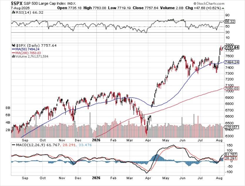
Look at that chart without a narrative attached and it is a good chart. It broke out. It is above the 50-day and miles above the 200-day. The oldest rule in trend following, popularized by Martin Zweig in Winning on Wall Street in 1986, is that the trend is your friend and you do not fight the tape. That rule has made vastly more money than any valuation model.
Is it expensive? Absurdly. Forward twelve-month P/E is 20.0 against a ten-year average of 19.0. The cyclically adjusted P/E sits at 42.39, against a long-run mean of 17.40 and an all-time high of 44.19 set in December 1999. We are inside a percent and a half of the dot-com peak on that measure.
Both things are true at once, and the failure mode of the bearish crowd is refusing to hold them simultaneously. Overvalued is not a timing signal. It has never been a timing signal.
What is worth flagging is the quality of the reasoning being used to justify each new leg. The argument moves. Six months ago the market rallied because the Fed was going to ease. Now the Fed is on hold, the futures market has flipped to pricing a possible hike, and the market is rallying anyway, because the economy is resilient. Those are contradictory premises producing an identical conclusion. When the conclusion is fixed and the reasoning rotates to fit it, that is not analysis. That is a search for permission.
None of which tells you when it ends. Nobody in this business is good enough to pick the top, and the ones who claim they are have a track record you can look up.
But there is a mechanism worth watching, and almost nobody is charting it.
Supply
Forget sentiment. Forget valuation. Think about shares as units of something, the way you would think about currency units.
If the number of dollars in the system goes up faster than the goods those dollars chase, each dollar buys less. The same arithmetic applies to equities. If the number of shares outstanding grows faster than the earnings behind them, each share is a claim on less. Price is set at the margin by supply against demand, and for fifteen years the supply side of that equation has been running in reverse.
Since the financial crisis, the single most reliable bid under this market has been corporate America shredding its own paper. Buybacks are still running near 1.2 trillion dollars annualized. Every dollar of that is share count going down.
Now look at what just happened on the other side.
US IPO proceeds hit 251 billion dollars in the first half of 2026, a first-half record that beat 2021, with eleven deals above a billion. Total US equity new issuance for the half came to 307.7 billion. UBS’s full-year estimate runs 200 to 350 billion in IPOs plus roughly 400 billion in secondaries, so somewhere between 600 and 750 billion dollars of new paper in a single year.

The individual deals are the part that should stop you. Alphabet raised roughly 85 billion dollars in equity in June, upsized from 80, with 10 billion of it taken down by Berkshire. That is the largest equity offering in history, and the stated purpose was AI infrastructure and compute. SpaceX priced its IPO at 135 dollars a share on June 11, raising 75 billion, roughly 86 billion with the greenshoe, at about a 1.75 trillion dollar valuation. That is the largest IPO ever completed, by a factor of nearly three over Saudi Aramco. OpenAI filed confidentially in June targeting something close to a trillion-dollar valuation and a 60 billion dollar raise. Anthropic filed confidentially on June 1.
And the reason all of it is happening at once is not a coincidence of the calendar. The four largest hyperscalers are guiding to more than 700 billion dollars of capital expenditure in 2026. Alphabet alone guides 180 to 190 billion. Meta guides 125 to 145. That spend has to be funded, and increasingly it is being funded with stock.
Paul Tudor Jones laid out the mechanism publicly this spring on Invest Like the Best, and it is worth stating plainly rather than quoting at length: the supply of stock rises while buybacks fall, because the same capital expenditure commitments that force the issuance also consume the cash that used to fund the repurchases. He described the US market as over-equitized at 252 percent of GDP, and drew the parallel to 2000, where the damage came not on the IPO date but later, when lockups expired and the restricted stock hit the tape.
Here is the honest state of play, and it cuts against the dramatic version of this story: net supply has not flipped yet. At 1.2 trillion in buybacks against 600 to 750 billion in issuance, corporate America is still retiring more stock than it creates. UBS expects that to hold through year end.
So this is not a signal that has fired. It is a signal to watch, and the specific thing to watch is the ratio, not either leg on its own. The moment buyback authorizations start getting trimmed to fund data centers while issuance keeps setting records, the machine that has absorbed every dip since 2009 starts running backward. That is a mechanical change in market structure, not a mood.
Michael Burry, who deregistered Scion in November 2025 and now publishes only through his own newsletter, wrote on August 4 that a “1987-type fall” is possible while conceding that new highs will pull new money in. One caveat on him that the headlines never carry: he is not short-only. His own recent post titles include “4 Shorts, 3 Longs,” and he covered his Palantir and Oracle shorts in the same stretch. The book is net bearish. It is nowhere near as apocalyptic as the coverage implies.
Where the money might already be lying in the corner
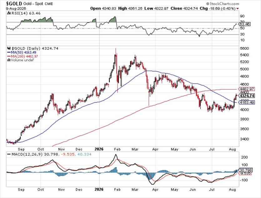
Gold spot closed the week around 4,324. Look at the shape rather than the level. Roughly 5,500 in February, a long grind down to just under 4,000 by midsummer, and now a sequence of higher lows and higher highs off that base. It is still below its 200-day at 4,483, but it has taken back the 50-day.
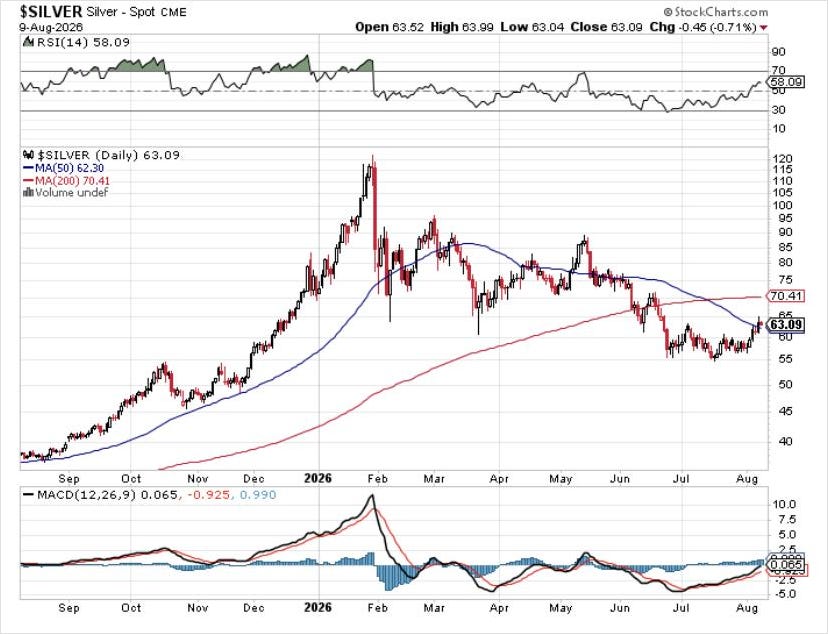
Silver looks similar in shape and worse in structure. Around 63, just above a 50-day at 62.30, and a long way below a 200-day at 70.41. It bounced off the mid-50s. It has not repaired anything.
The miners are the interesting one. GDX closed Friday at 89.89, up 7.11 percent on the day. Peak near 115 in March, a brutal slide to roughly 70 by July, and now a move that has carried it back above its 200-day at 87.37, with the 50-day at 78.44 turning up underneath it.
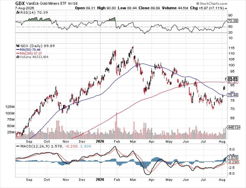
That is the whole argument for preferring the miners here, and it is not a story about gold bugs or debasement or any of the usual furniture. It is that of gold, silver, and the miners, exactly one has reclaimed its 200-day. The metal is the underlying. The miners are the leveraged expression, and they are the ones printing the better structure. If the macro read is a weakening economy and eventual pressure on real rates, the leveraged expression is where the convexity lives.
Bitcoin is bouncing too, at roughly 64,900, off a June low near 57,000. But it is still under a 200-day at 70,015 that has been sloping down for the better part of a year, and it is a long way from the 115,000 area it traded last autumn. Same bounce, much worse chart.
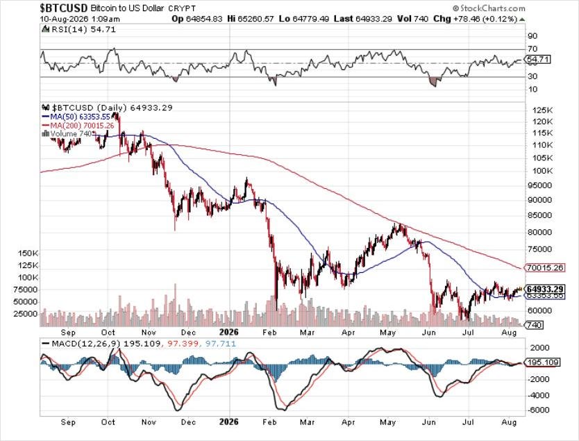
Given a choice among the four on chart structure alone, the miners are the only one where the trend has actually turned rather than merely paused. None of this is investment advice, and the discipline that matters more than the pick is not buying into a downtrend just because the macro thesis feels right. Falling knives do not care how correct you are.
The most hated bond on earth
The 30-year Treasury yield closed Friday at 5.20 percent. Trough near 4.55 last October, a steady climb all year, a 50-day at 5.04 and a 200-day at 4.88, both rising.
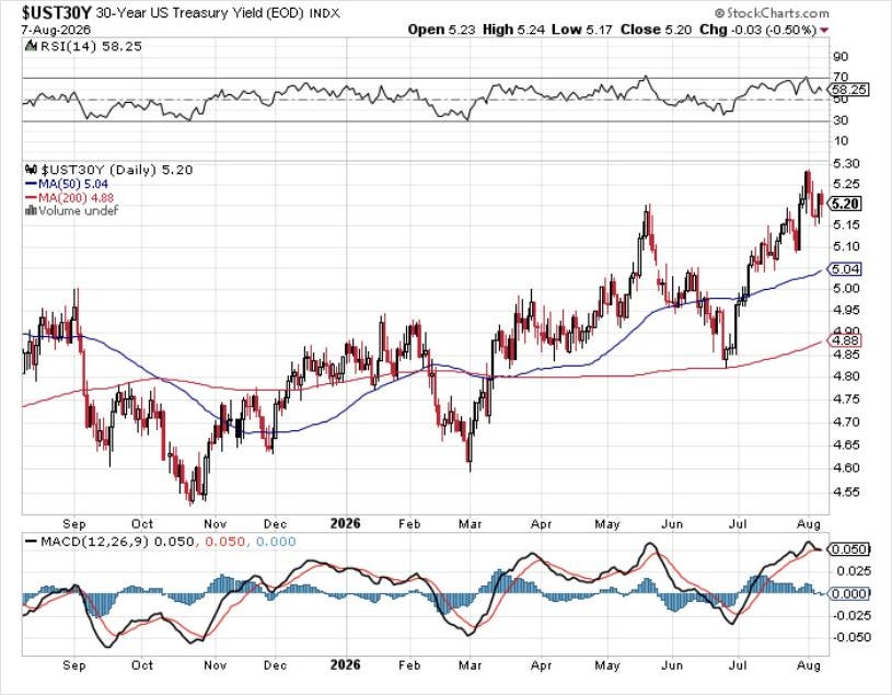
There is not a more universally despised asset in the world right now. The consensus says the long end goes to six, then eight, then fifteen, and the reasoning is always some combination of deficits, issuance, and de-dollarization.
The contrarian case is not that the consensus is stupid. It is that the consensus is already positioned. When everyone who was going to sell has sold, the marginal seller stops existing, and the asset stops going down on bad news. That is the setup that makes a hated long interesting.
But the chart says wait. Higher highs and higher lows in yield means the trend is still up, which means the price trend is still down, and buying it here is fighting the tape for the sake of being early. The condition to watch is straightforward: yields need to start printing lower highs and lower lows, and then break back below the 5.10 area toward five. That is where the macro view and the tape would finally agree. Until they do, the view is a view, not a position.
The week ahead
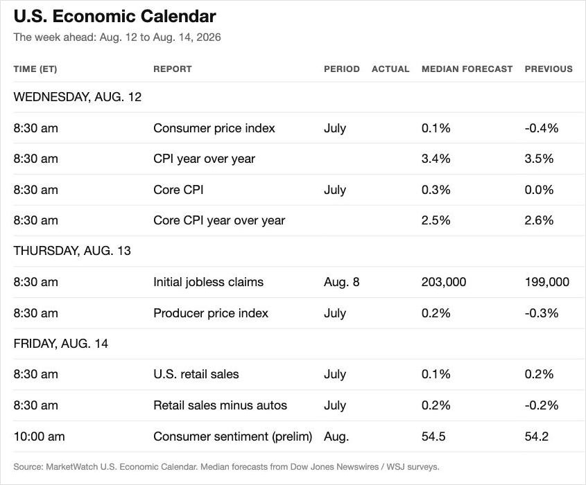
Wednesday, August 12: CPI. Headline is forecast at 0.1 percent for the month and 3.4 percent year over year, down from 3.5. Core is forecast at 0.3 percent monthly and 2.5 percent year over year, down from 2.6.
Look at the spread between those two, because it is the single most under-discussed number in this market. Headline at 3.4 and core at 2.5 means the inflation problem is almost entirely energy. And energy has already broken. Brent touched 126 dollars intraday on April 30, a four-year high, on Strait of Hormuz blockade fears, and settled at 114.01. As of Friday, Brent was near 85 and WTI near 78. That is a third off the high. The Middle East risk premium is real and it can return without warning, but the thing that has been keeping the inflation narrative alive has been retracing hard for three months while wage growth decelerates to 3.2 percent. That combination is disinflationary, not inflationary.
Thursday, August 13: initial claims are forecast at 203,000, and PPI at 0.2 percent. Claims is the number that matters. Not because 203,000 tells you anything, but because the four-week average is the tripwire, and it is nowhere near tripped.
Friday, August 14: retail sales forecast at 0.1 percent, and preliminary consumer sentiment at 54.5. Sentiment has been sitting near record lows for months while the index makes record highs. That gap is the entire story of this economy in one comparison.
Then September 16, the FOMC. The Fed has been on hold at 3.50 to 3.75 percent for five straight meetings under Kevin Warsh. Futures are roughly 55 to 60 percent on another hold and 40 to 45 percent on a quarter-point hike, with those hike odds having dropped sharply after Friday’s payroll print. No cut is priced at all.
Sit with that. Payrolls went negative, wage growth is decelerating, oil is a third off its high, and the market’s base case is still that the next move is up. If that is right, the equity market is trading at a 42 CAPE into a tightening cycle. If it is wrong, something in the labor data is about to become impossible to explain away.
What would prove this wrong
The bear case here rests on one load-bearing claim: that hiring has frozen while firing has not yet started, and that the second half always follows the first. If that is right, the four-week claims average moves through 250,000 and toward 300,000 in the coming months, the household survey keeps bleeding, and the participation rate keeps falling for reasons that have nothing to do with anyone’s border policy.
If it is wrong, it will look like this. Claims stay pinned near 200,000 through the autumn. Payrolls revert positive in August and September without a downward revision. Participation stabilizes. GDPNow is vindicated and Q3 prints somewhere north of four percent. In that world, July was a statistical air pocket in a genuinely strong expansion, and the correct move was to own the index and ignore the noise.
Both of those are live. Nobody gets to know yet. There are no certainties here, only probabilities, and the honest version of the probability is that the labor data has been deteriorating for three consecutive months while every explanation offered for it has a shorter shelf life than the last one.
Watch the claims average. Watch the buyback authorizations against the issuance calendar. Everything else this week was commentary.
Facts > Narrative. Always.
Stand up for freedom, liberty, and free market capitalism.


